Our House - Before & After
My husband Chris and I live in the city of Chicago, in a small neighborhood called University Village with our sweet dog Shelby girl. We absolutely love our little "suburb" in the city, and the house that we have worked so hard to turn into our home, sweet, home.
We purchased our circa 2000 builder grade townhouse (Eeeeek) in 2017 and have been working hard to rehab, customize, and make it own ever since. As you'll see from some of the before photos, it's definitely come a long way since then, and we've had a lot of fun and fails doing it. Because we know we won’t be in the city forever we have tried to be as efficient and as financially savvy as possible when making upgrades and investments throughout. My mission is ALWAYS to “Get the Look for Less” when and wherever possible.
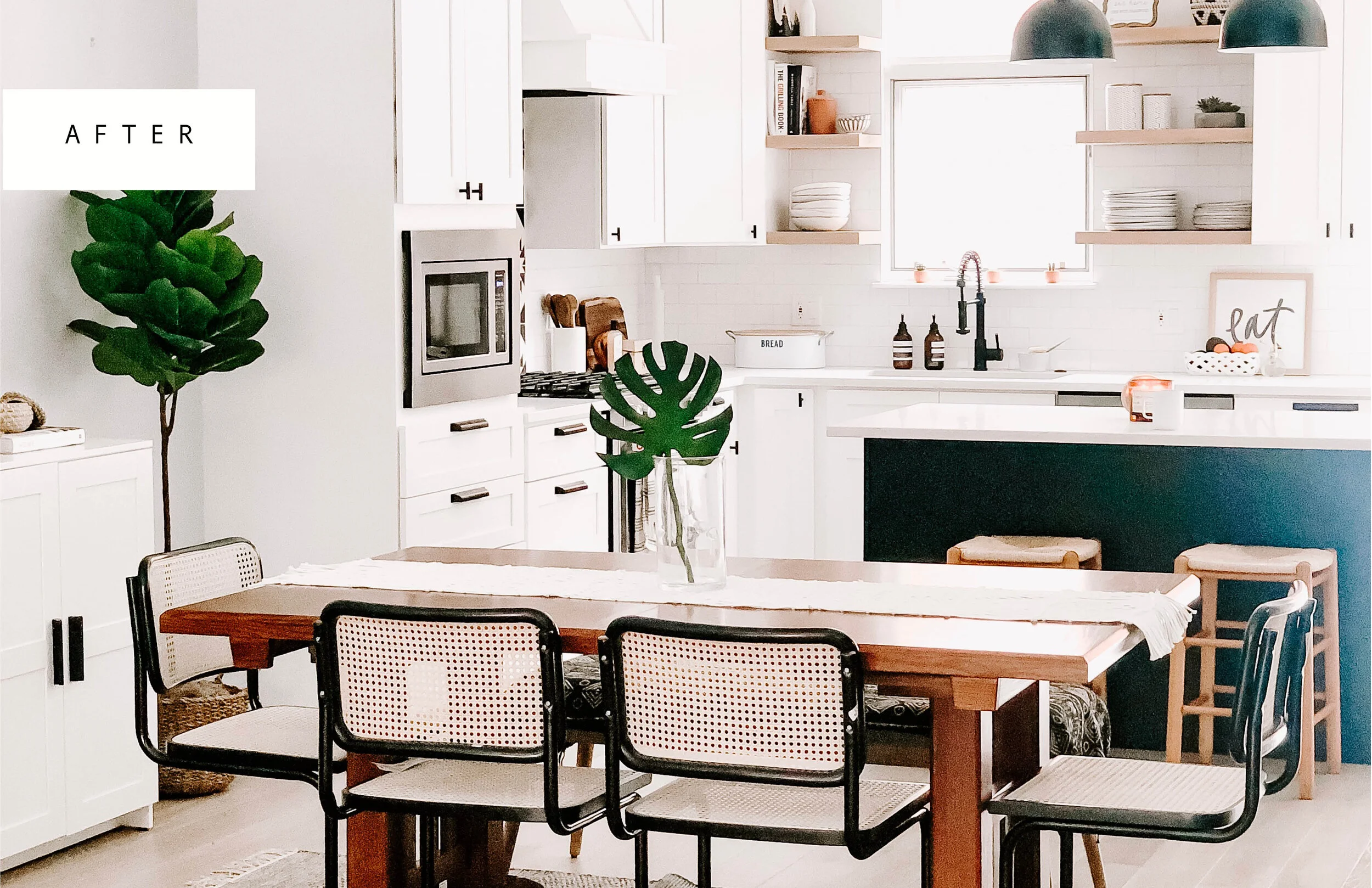
First thing was first, we HAD to take down this awful partition wall between our dining room and kitchen. This was something I decided needed to be done before we even put an offer down on the house and it was pending whether or not this was possible that we would ultimately make our decision to buy.
Opening up the space has made such a difference. It completely transformed the entire main living area, and allowed us the room to add an island (the absolute best spot for friends and family to gather around).
KITCHEN (kitchen sources)


We worked with a General contractor on our kitchen space and didn’t have to DIY anything on our own here. We were too nervous as rookies to deal with moving gas, HVAC and electrical. I did however work on the design layout myself after our contractor gave us initial blueprints, I brought the file into photoshop and tweaked it a million different ways to get it exactly how I envisioned it.
One other thing we did to save was order all of the details in the space on our own – accent tile above the stove, backsplash tile, hardware, light fixtures, sink, faucet, and our hood/range above the stove. Ordering all of these elements on our own helped us save tremendously and it really expanded our options, allowing us to get the customized look that we wanted. This cement tile backsplash from Cement Tile Shop behind our stove is one of my favorite details.
DINING ROOM (dining room sources)


When we opened up the kitchen to the dining room and main living area we decided it was best to update the flooring as well. We opted for this light wide panel engineered wood from Terra Legno and it’s held up great. Best of all, the color really blends with the color of our dogs hair (highly recommend this tactic when looking into purchasing any type of flooring).
A few of my favorite details in our dining room, include this large scale chandelier from West Elm and our gallery wall, which is made up of a collection of some of my favorite pieces from vintage shops, local artists, and our travels.
FAMILY ROOM (family room sources)


Our two big DIY projects in the family room were the faux shiplap fireplace and this “built-in” nook in the corner between the fireplace and the exterior wall, which I lovingly call, “The Lazy Girl’s Buitl-in”. Both projects were relatively inexpensive, easy to execute and make such a huge difference in the space.
TV ROOM (TV room sources)


By far my favorite room renovation in our whole house is the TV room. I say this for a few reasons, 1.) Impact vs. Cost. The difference we were able to create in this space for the amount of money we put in was astounding. 2.) The “built-ins”. It’s been my dream for years to have a built-in unit like this to style with all of my odds and ends.


My heart sank when we got an estimate for $8,000 for custom a built-in. We were NOT going to pay that, and I was determined to figure out a solution. We were successfully able to create this “built-in” look for under $800 dollars. That’s right, we knocked a whole ZERO off of that estimate, which is why I like to call these my “Ballin’ on a Budget Built-ins”. We levered all IKEA Billy Bookcases and followed the Bless’er House Blogs’ tutorial. We made a few tweaks to the tutorial steps to accommodate our needs, like adding the Billy Book case doors for hidden storage. Living in a house in the city doesn’t offer much storage space so I’m always looking for ways to maximize every nook and cranny in here. Some videos of the build out process can be found on my Instagram highlights labeled “BUILT-IN” . Full blog post on this room coming soon.
POWDER ROOM (source links)


LOL, is all I can say about the DIY process for this space. And I’m glad I can laugh about it now. What started off as a supposedly easy weekend project turned into one disaster after another that resulted in a 3 month ordeal. More to come on that. It sure does look pretty now.
FUN FACT: The entire wall from top to bottom is wallpaper.
MASTER BEDROOM (source links)


We didn’t do a whole lot in our master, just painted the walls and added this textured wall paper detail behind our bed. If you haven’t noticed, textured wallpaper is common theme in our home. It’s a great way to pack a punch on a budget. More on that, including a round-up of my favorite textured wallpapers coming soon.
ROOFTOP (source links)


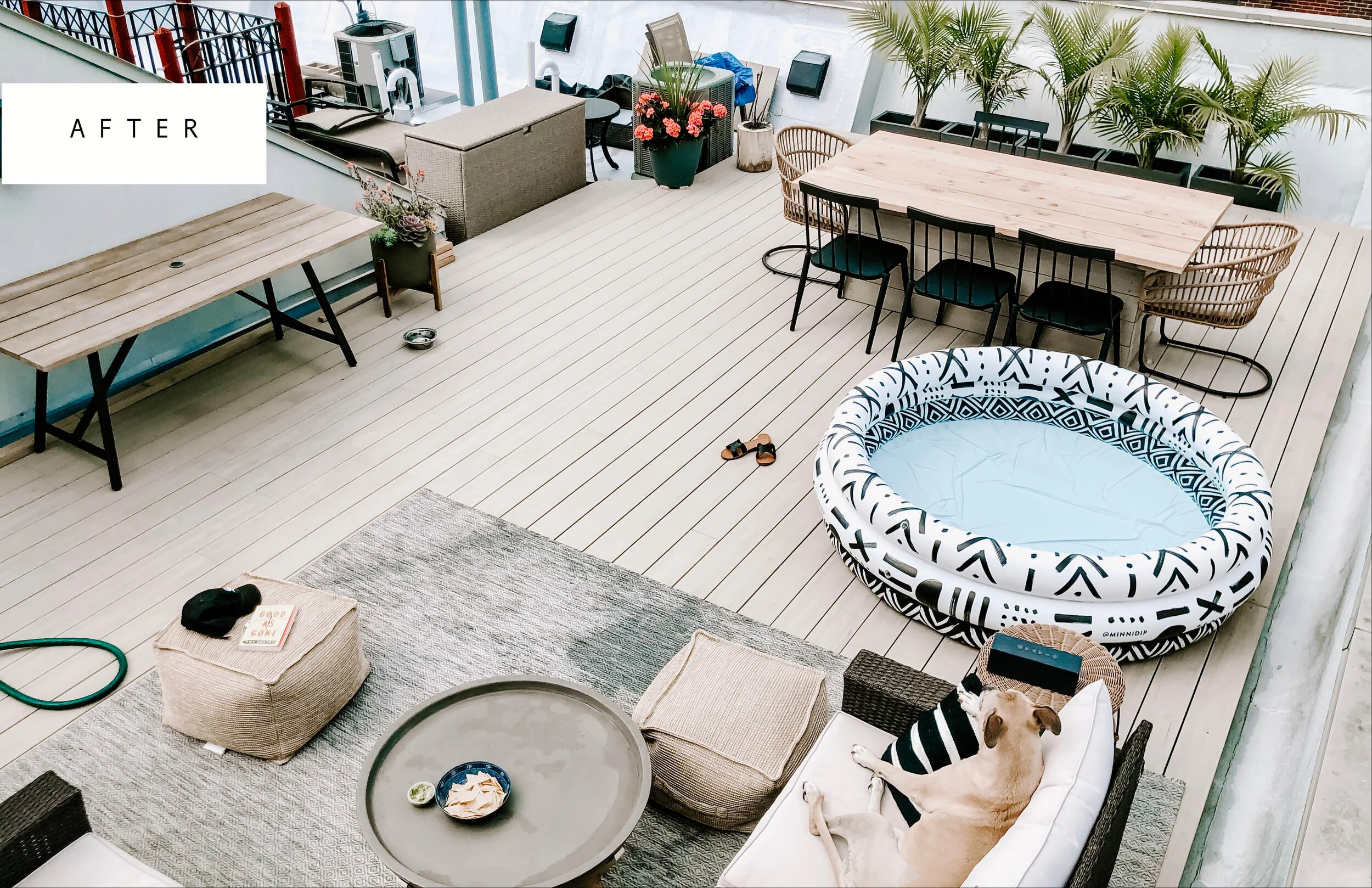
Finally, the rooftop. Our urban oasis and little slice of paradise. Outdoor real-estate in the city of Chicago is hard to come by, so when we saw the rooftop space and all it’s potential we were SOLD on this house.
Our goal on the roof top was to maximize as much space as possible. When we purchased the house only about 50% of the space was being utilized and the other half was gated off to house the HVAC unit.
Our big DIY project on our roof deck was creating a custom dining table that doubled as a cover to hide the hideous and poorly placed ventilation system and miscellaneous pipes. By doing this we were able to double the livable space on our rooftop. This seems to be a common problem on lots of Chicago rooftops and this was a great solution.


I feel so grateful that we have been able to renovate so much over the course of the last 3 years. Still on the docket…
Guest Room/Office Space
Future Nursery
Master Bathroom
Guest Bathroom
We’ve already hit our investment mark for how much we are willing to put into the house in order to make back in resale value what we put in, so all of the above projects will be very very budget friendly. Be sure to stay tuned and follow along on instagram @chitownhouse for some fun DIY tips and tricks on how to create an elevated looking space on a shoe string budget.


